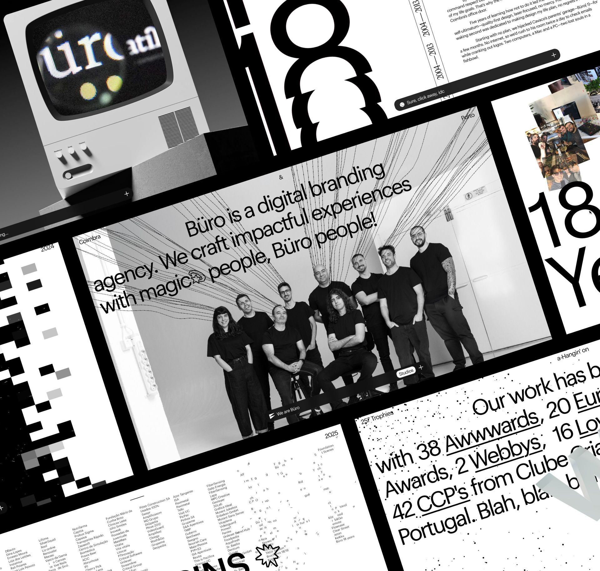
18 years in the making.
Our brand-new site cements Büro’s place on the design swagger board—clean without being boring, edgy without trying too hard.
Four years ago, we took our first real shot at the impossible: a studio site that truly showed who we were. It landed halfway. This time, we did it right—mission accomplished. Meet the magic people: the Büro people.
Ask any design studio what the hardest project is, and most will say: their own website. When you design for others, there’s just enough distance to stay sharp. But when it’s your own brand, you know too much and aim too high. Expectations spike. Objectivity dies. Nothing feels good enough. It’s not healthy. It can drive you mad.
In hindsight, we spent thirteen years without a proper website. Seven of those years ran on a basic build, followed by a one-page landing from 2013 that somehow lasted another six. We were too busy building sites for others, and ours demanded more than we could ever spare. More work. More time. More maturity.
What started as a one-year effort stretched into two. Two years collecting fragments from our journey. Writing. Editing. Revisiting work we hadn’t touched in years. And yes, showcasing everything—from the very first logo back when grunge was still in style to our most recent builds.
But this wasn’t just about portfolio. It became a deep dive into Büro’s identity: from type and design to motion, sound, and code, every detail reflects our fearless and personal approach to digital storytelling. This is own identity turned inside out—bold, unapologetic, and unmistakably Büro.
Büro builds brands for digital. That’s our core. But most companies don’t let their identities break the rules or truly play. This was different. Our space, our identity, our rules. So we did exactly what we preach.
And here we are, closing the loop by talking about it.
- Audio Design
- Motion
- Typeface
- Website
- ADC*E Silver
- Agencies League #1 Design Studio in PT
- Agencies League TOP 20 Branding
- Agencies League #2 Overall Ranking
- Agencies League #1 Digital Design Studio
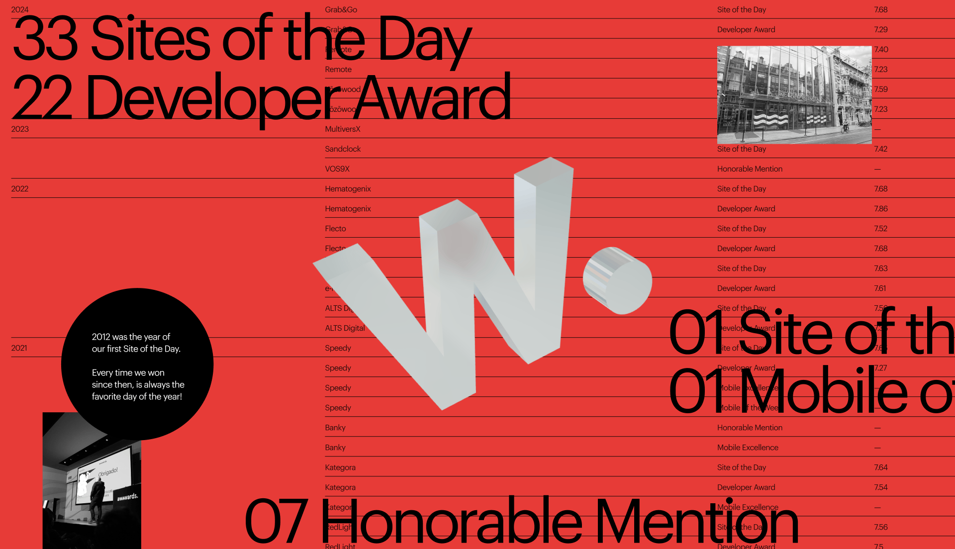
- Awwwards Site of the Day
- Awwwards Developer Award
- CCP Bronze
- CCP Silver
- CSSDA Website of the Day
- CSSDA Website of the Month
- EDAwards Gold
- FWA Site of the Day
- Muzli Picked
- The Lovie Awards Gold
Website
We partnered with Commercial Type to nudge Gräphik closer to grotesk—cleaner numerals, sharper alternates, and our own emoji set for baseline storytelling without code bandages.
Swiss-born and browser-raised, the design is clean, grid-first, and soaked in negative space. But it’s disrupted by interactive dots, lines, and glyphs. We even dropped anti-aliasing for a raw, punk edge—think Kid A in pixels.
Code drives experience: dots, lines, and glyphs trigger a WebGL-powered audio layer. Scroll and you’ll hear Bach piano notes, punctuated by silence—a sonic detox and our quiet manifesto for those with more than 30 seconds to spare.
Watch for the böt on the menubar: not AI, just a human pretending to think like one. Confusing, but helpful.
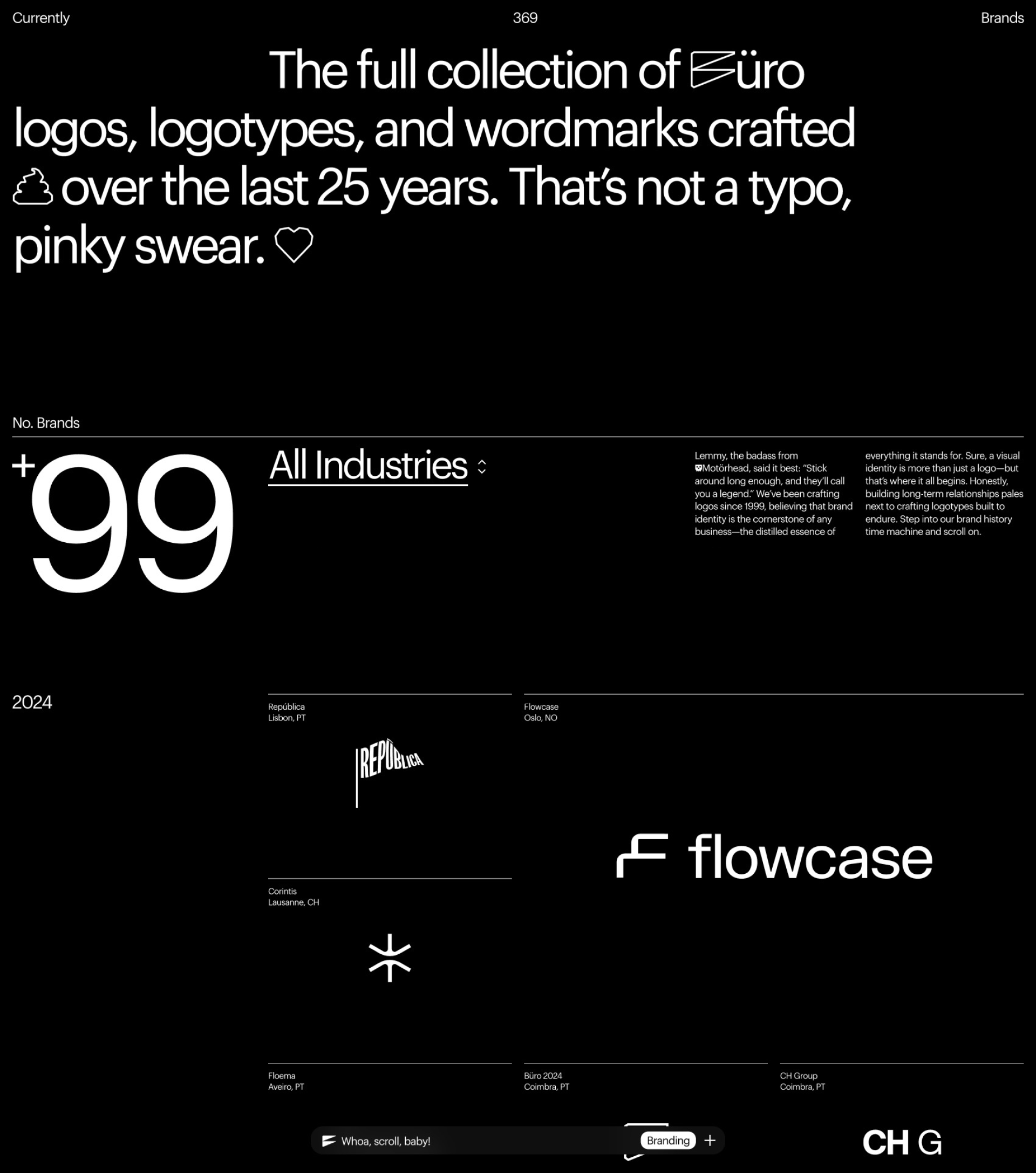
At its core, this is Büro distilled—bold, weird, and painfully crafted. Each case shows how we elevate brands digitally and hints at what’s next. Nearly 400 brands so far, each with our best take. A book’s coming. Delays too.
Just don’t mess with the nipple statue. It’s part of the legacy.


Chaos, now archived. A chronicle of becoming, where no pixel or person goes unnoticed.
18 Years of Bürocratik
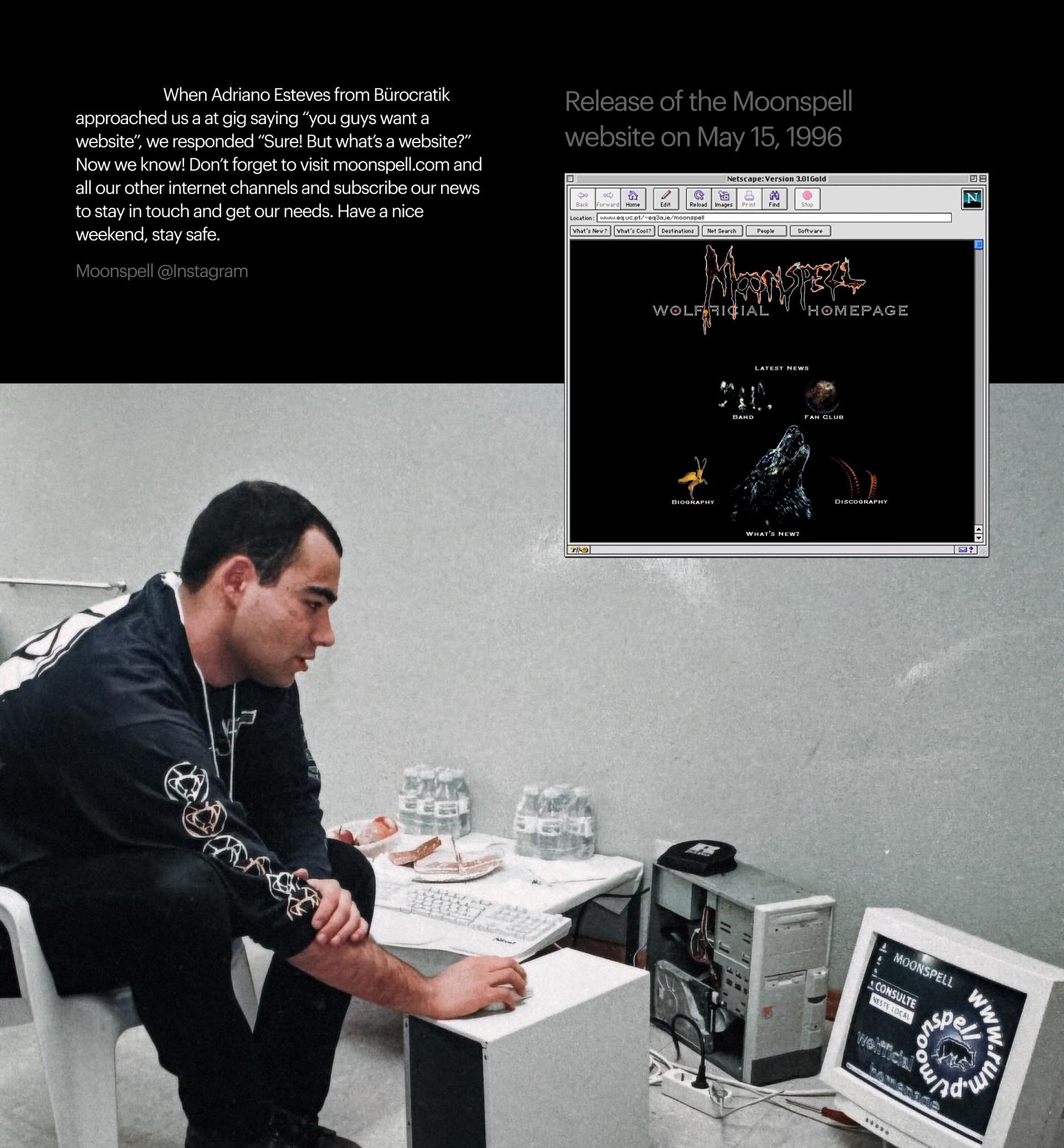
Studio life mirrors life itself—an evolution from spark to completion, each phase layered over the last. You can’t fast-forward it—just like life, it unfolds. From the dark ages with Moonspell, to the early days, first awards, the Covid years—this is a raw, genuine reflection of the journey. Featuring never-before-seen websites like Awwwards 7DD and unreleased brands. All in.
What began in May 2023 as a new website became a two-year journey of stories, photos, and memory. Doing things slowly has always been our mantra. In the Artificial Inteligence era, craft will be the new luxury—and we’re all in.
Along the way, we realized we had enough for a book—a tribute to our team and everyone we’ve met. The result? A mini-site with four team-focused chapters, a 530-page book, and the perfect excuse to reunite the entire Büro gang to wrap it all up. Thank you Büros.


As for audio? We went all-in on experiential sound design, a true audiophile’s dream wrapped in interaction.
Audio
Most websites ignore sound. Not here. We treat audio as a sense—and we use it. The UX concept? Scatter sound across the site so interactions form custom compositions—some of which we later released on vinyl.
It all starts with the Reel, front and center on the homepage header. It’s frenetic, sharp-edged, and not for the faint of heart. But if we only have 40 seconds to get your attention, it better be loud. From there, two audio layers unfold: reactive WebGL-triggered loops that act like live, code-shaped instrumentation, and a scroll-triggered, Bach-infused piano score with intentional silences—our quiet manifesto for those who linger a few more instants.
All sonic interactions were crafted with visual-audio artist Ben Jordan (aka klsr.av), over months of R&D. Bach’s legacy helped guide the low-key tone—structured, intricate, and timeless.
The 404 game also comes with a sound layer—actually, quite a rich one. Six custom tracks reinforce the arcade mood, served randomly so the vibe shifts with every visit. And then there’s a wildcard: one pearl of absolute zen, Chet Baker’s Blue Room. Unworldly, out of this world. It cuts through the game’s pulse like a quiet spell.
A 404 so good, you’ll wish more links broke. Getting lost? Half the fun.
404! I’m lost too.
The 404 page has always been our favorite playground, it's the perfect test of how far we can push a website’s narrative. So of course, we went overboard.
Each team member got AI-scrambled into a game avatar—adding a personal layer to every playable character: Adriano’s black metal persona Darko, José’s Midwest cowboy hat, António’s sexy Viking flair, André’s cat companion, Hugo’s Sherlockian pipe, Pedro’s oversized Mexican sombrero, Santo’s chef toque, Daniel’s Che Guevara cuban cigar twist, and Amorim’s nostalgic CD-R pile ready to record… Nevermind. All avatars come locked and loaded with emoji bullets, straight from our custom typeface.
Win the game, win the pins—we turned those emojis into a collectible pack. And if we ever find time to finish the scoreboard, top monthly players get the real thing. We just have to finish the game before December 🤌.
This is self-promotion at its boldest and most self-confident. With creativity at its core, Bürocratik’s website refuses to play by the rules—and that’s precisely the point. The jury praised it for being out of the ordinary, humorous, and technically innovative, blending design, code, sound, and motion into a fully orchestrated digital experience. Every micromoment is considered, surprising the user with attention to detail and interesting copy that reflects a strong sense of identity: “you know who you’re dealing with.” This is not just a studio showcasing its work—it’s a studio showing exactly who they are, with personality, humour, and a relentless urge to communicate. Bürocratik’s site is unapologetically personal, experimental, and alive—a standout piece of digital storytelling and brand expression.